#Aria Enabled TRUE
What is ARIA?
ARIA is short for: Accessible Rich Internet Applications. This basically means that you can add several attributes to HTML elements, giving them more context or add relations between elements. When it's properly used, these can provide a more accessible web-page (for more thorough explanation on aria labels and examples check the documentation of Mozilla, MDN - ARIA).
Why use ARIA?
At the final stage of the MINOR: Web-development CMD Hogeschool van Amsterdam, I had the chance of designing for one of the most underrepresented target audience you can imagine: the visually impaired. Designers seem to assume that this audience is relatively small, but the opposite is true; this audience consists of 2.2 billion people out of the 7.6 billion people on this earth (WHO - 2018). Imagine all these people not being able to surf the web because designers act like they don't exist!
Especially at this time, when COVID-19 is restraining our daily routines. A simple appointment with your hairdresser becomes an online event and a lot of public occasions require online reservations. But, how would that work for the visually impaired? They also need haircuts, groceries or other online shopping.
The problem we faced
Then Q42 with Rijksmuseum - Amsterdam as their client approached us with the following problem: Their ticketflow wasn't quite accessible, or actually not accessible at all. At this time it was impossible for people that can't see the screen to successfully interact with their design.
When a ticketflow is as complex as the one of the Rijksmuseum's, the problem was too big for a bunch of ARIA labels to seal the deal. Making use of ARIA labels is one thing, but making, in this case, a ticketflow user-friendly and a pleasant experience that's another cook*.
"That's another cook" - Louis van Gaal
When we started to work on this project we firstly made the ticketflow as Q42 designed it (linking it to a dataset etc.) and decided to refactor along the way. When we had a rough basis of the entire flow (1 week of intense labor) we started to make sketches of alternative flows. Taking in account the most difficult parts of the flow: the step to pick a date and time slot and the ticket selection step. In their current design, they had combined the date picker with extra-options such as donation possibility and additional multimedia tour. We decided that these extra options would best be served on a different step to relieve the user with one primary action per screen.
How do I make my product accessible with aria?
First of all, you need to keep in mind that ARIA isn't going to make you solve your problem when you are not making use of proper HTML elements. But we found at least one exception in our design. I will tell you more about our inaccessible part in a bit, but first let me explain how we made our complicated ticketflow into a friendly conversational interface.
We started digging in ARIA and how to properly use it. We discovered the following useful ARIA labels:
aria-describedbyaria-labelledbyaria-controlsrolearia-livearia-hidden*Hidden!? yes, hidden
Aria-describedby
Like the attributes says you can use this attribute to give more information on for example an option in a form.
<input aria-label="Entree museum.De prijs is €0.00 per groep. Dagelijks van 9 tot 17 uur"
aria-controls="ticketInfo" type="radio" name="ticketOption"
value="Entree museum,96D63FDB-6647-EA11-A2E0-D9C772E4E9DA,0,per ticket"
aria-describedby="item[0]">

<p id="item[0]">
Here you can put additional information about the option above.
</p>
So in this example we use the id of the <p> and pass it to the aria-describedby we now know that if the user has focus on the input the screen reader will add more context to this radio button by reading the inner text of the <p> element.
Aria-labelledby
This attribute works the same as the describedby, but the major difference between the two of them is that a label provides essential information about an object while a description provides extended information that the user might need. MDN - labelledby.
When working with inputs you can better use input and label combination this does exactly the same as the labelledby attribute. Example:
<label for="yourID">&<input id="yourID">.
Aria-controls + roles
When compiling an order, we have the content of our shopping cart continuously changing. For people that can't rely on their sight it's really hard to keep them informed about their order. This is where aria-controls come in place. There are some things you need to know before you go wild with this.
- aria-controls can only be used on HTML elements that already exist in the DOM-tree and which can be navigated to.
- it create's a relationship with certain HTML elements based on id
- its doesn't have full support among all browsers
- shifts focus to a different HTML element skipping all content in between
(for more information on how to dynamically change contents of your element and using aria-controls check MDN - ARIA live regions).
A very powerful tool that can improve the UX greatly for screenreaders and browsers that do support it.
So how did we use this? We wanted to inform our user that when he made a selection on lets say a ticket choice. The page would then update our user with the state of the shopping container. So he'll be hearing whats inside his shopping container. The total amount of tickets and the total price, read out to him. The html element which contains this message (you linked it with this id: aria-controls="thisID") gets a role="status" and aria-live="polite" more on that later.
This is a code example of how to set up this kind of relation:
<input aria-controls="ticketInfo" type="radio" name="ticketOption"> // Input you want to select
<section id="ticketInfo"> // container you link the input with
    <p>
            // everything inside this container is now important to the screen reader
            <output id="aantal-first-step" class="block-right" role="status" aria-live="polite"> Totaal aantal tickets: 4</output>
            // assigning `role="status"` to this element telling the screen reader to read whats inside when a change occurs
        </p>
        <p>
            // u can easily work with multiple elements to interact the same way!
            <output id="total-first-step" role="status" aria-live="polite">Totale prijs: €58.00</output>

        </p>

</section>
When updates on a page happen continuously this can get very annoying. This is why you want to use Aria-live!
Aria-live
This attribute will tell the screen reader how important this change really is.
polite
By giving it the polite value you tell the screen reader: This is important but you can inform the user while he is not busy navigating or consuming other information. So when the user is idle the change event will still trigger the update of the shopping list. Keep the user in control and do not overthrow them with information from continuously updates.
off
This is the default setting which is great because you don't have to worry everything starts screaming to the user.
assertive
You should never use this on a shopping cart especially when a user can select a number of items. The screen reader will then annoy the user with endless bloat on information changes. This is a real bad experience imagine someone speaking in your ear every time you add one item of the same product in your order.
“Make your product accessible by making some things inaccessible”
Aria-hidden
We found out about this one the hard way. When we acquired some knowledge about aria we started building it inside our flow and we were ready for our first user test! We had made a beautiful design with allot of fancy buttons where our user could click on it was really magnificent. (see the image below)
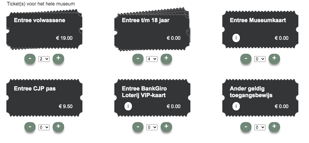
So what happend was that every button you see on the screen, the little greenish dots with "minus" and "plus", were being read out to the user lik so: "Button, dash. Button, plus." On which our candidate replied: "What does that mean? I just made a selection on the amount of tickets and now i have this button says plus? I don't understand...". And that happend exactly 6 x 2 = 12 times. So we felt really stupid we made terrible UX for blind people. How can we fix this. we asked our user if he could easily work with the drop drown he said it was the best UX because it can handle different kind of inputs. You can enter digits letters or navigate with the arrows or other predefined keys made by the user.
And aria-hidden has weird results cross-browser when used on target able elements like <a>, <input> and many more, but also our cute little <button>. But we wanted to make this button inaccessible for our user. Despite the fact button was the semantically correct element to use it gave us results we didn't want. Thats why decided to refactor the button to a <div> that way we didn't have to worry about our visually impaired users that they accidentally get focus on the button element. Because a <div> by default has no tabindex and could not be reached bij the "tab" key. Now our user doesn't get annoyed with buttons he doesn't understand. And we left them in our design because other users might prefer the use of the buttons when quickly wanting to add one or two tickets. So now we made our product actually more accessible by making some elements inaccessible for specific users who rely on high accessibility standards.
After some more we testing finally created a pleasant UX for visually impaired, motor impaired and users without disabilities. Our prototype is still live: Link to live demo Curious about this project? Its completely open source and can be found on Github. side note: Repo is writen in Dutch.
I wanted to thank:
- My teammates: Manouk Kappé & Mohamad Al Ghorani who worked with me on this project.
- Vasilis van Gemert, for inspiration on the topic.
- My test candidates, for giving me the insights in this project and the matter of the importance of this article.
- Q42 and the Rijksmuseum, for giving us the opportunity to re-design their ticket flow.